HalationStudio Portfolio
A one-page portfolio for design and motion studios, with a headline that glows like light on film
Not on sale yet
This one is almost ready to buy. Leave your email and we will tell you the moment it is.
- Pay once, lifetime license
- Free updates for life
- Full source: HTML / CSS / JS + React
Live preview
About
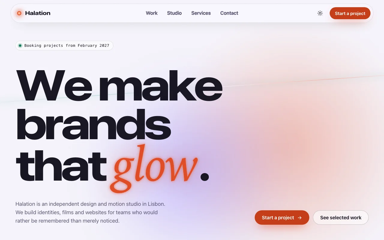
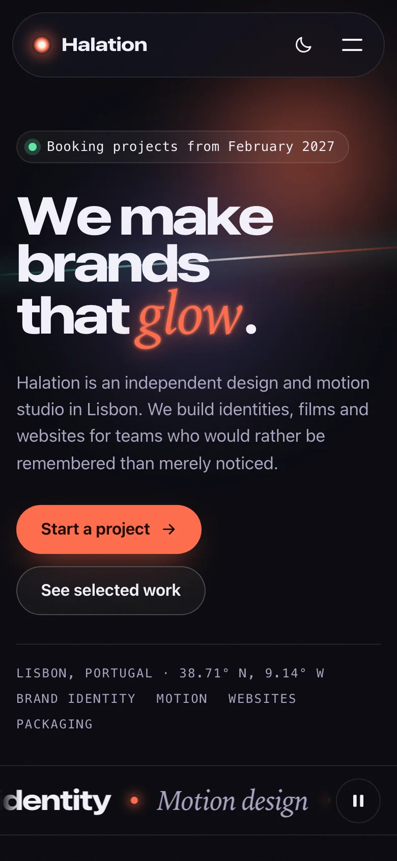
A portfolio for a studio that wants to be remembered, not merely noticed. Halation is named after the warm glow that blooms around bright light on film, and the page is built around that idea: the headline arrives letter by letter and one word flares, then settles into a soft glow. Below it, a quiet, editorial layout lets the work do the talking.
- Wide, heavy display type with a serif-italic accent — all from the visitor's own system fonts
- A work grid that rearranges itself as you filter, with full-width feature cards every third project
- Eight pieces of generated artwork (a roastery bag under the northern lights, a film-festival sunset, a record in its sleeve…) so the demo looks finished before you add a single image
- Frosted-glass header, film grain and a light source that breathes — in light and dark
- Real, believable copy for a fictional Lisbon studio, ready to replace with yours
Two builds are included. The HTML version is one page you can open and edit in any text editor
and host anywhere. The React version is a complete Vite + TypeScript project: every word lives in
one content.ts file, and npm install && npm run dev starts it.
Features · 9
- One complete page: header, letter-by-letter hero, services marquee, filterable work grid, studio and count-up stats, services and process, testimonials, contact form, footer
- Two builds: static HTML/CSS/JS you edit in place, and a ready-to-run Vite + React + TypeScript project
- Eight projects with generated artwork — no images to license, no web fonts, no external requests
- Light and dark themes: follows the system, remembers the visitor's choice
- Contact form with clear, specific error messages; point it at Formspree or any form service with one attribute
- Every colour, font, radius and timing is a CSS custom property
- Responsive from 320 px phones to wide desktops
- Script and stylesheet together weigh about 14 KB gzipped
- No runtime dependencies besides React in the React build
How to use it
Open index.html in a text editor: every word on the page is written there, so it is what search
engines read. It links two files that sit next to it:
<link rel="stylesheet" href="studio-portfolio.css" />
<script src="studio-portfolio.js" defer></script>- Projects: copy one
<li class="sp-work__item">per project.data-categories="branding motion"decides which filters show it (the filter buttons use the same names indata-filter). - Images: replace a project's
<div class="sp-art" data-art="…">with<img class="sp-art" src="work/my-project.jpg" alt="…" />. The eight generated styles areaurora,reel,field,kiln,vinyl,specimen,moonandpeak. - Numbers:
<span data-countup="140" data-suffix="+">140+</span>counts up todata-countup(alsodata-prefix,data-decimals). Keep the final value as the text. - Headline:
<h1 data-split>is split into letters by the script; wrap the word that should glow in<em>.
The script wires everything by data attribute once the page has loaded. For markup you add later,
call StudioPortfolio.init(container); it returns a function that undoes it. The readable source is
in src/ (src/core/ holds one small module per behaviour) if you want to rebuild it.
The download is a complete Vite + React 19 + TypeScript project:
npm install
npm run dev      # http://localhost:5173
npm run build # static files in dist/src/app/content.ts— every word, project, number and link. Edit here and the page follows.src/app/sections/— one component per section;src/app/ui/— the smaller pieces they share.src/core/— the behaviour (theme, menu, filter, count-up, form…), the same code the HTML build runs, attached with theuseBehaviourhook.src/studio-portfolio.css— the one stylesheet both builds use.
With no action, the form only checks the fields and shows the thank-you message, so the demo
works offline. To receive messages, give it the address of a form service — Formspree, Getform,
Basin or your own endpoint that accepts a form POST and answers with a 2xx status:
<form class="sp-form" action="https://formspree.io/f/your-form-id" method="post" novalidate …>In React, set action in CONTACT in content.ts. The fields are sent as form data with
Accept: application/json; if the service answers with an error, visitors see a message asking
them to try again or email you. The hidden _gotcha field catches simple spam bots (Formspree
reads it too).
Error messages live on each field: data-error-required, data-error-short (for minlength) and
data-error-email.
Everything is a custom property on :root, at the top of studio-portfolio.css. Colours are
written as light-dark(light, dark), so one line covers both themes.
| Property | What it changes |
|---|---|
--sp-bg, --sp-bg-raised, --sp-text, --sp-muted, --sp-line |
Page, field and text colours, hairlines |
--sp-ember, --sp-violet, --sp-cyan |
The glow colours: accent word, light source, highlights |
--sp-cta, --sp-cta-hover, --sp-on-cta |
Main button and its text |
--sp-focus, --sp-danger, --sp-success |
Focus ring, form errors, availability dot |
--sp-glow-strength |
How strongly the glows show (set per theme) |
--sp-font-display, --sp-font-body, --sp-font-accent, --sp-font-mono |
The four type roles |
--sp-display-stretch, --sp-display-weight |
Width and weight of the display type |
--sp-radius-lg, --sp-radius, --sp-radius-sm, --sp-max, --sp-gutter |
Shape and layout |
--sp-ease, --sp-letter-stagger, --sp-marquee-duration, --sp-reveal-duration |
Motion |
Fonts: the page uses system fonts only, so it loads nothing. To use your own, add an
@font-face (or a font service's stylesheet) and set, for example,
--sp-font-display: "Your Display", sans-serif;.
Theme: data-theme="light" or "dark" on <html> fixes the starting theme; without it the
visitor's system decides. The toggle remembers a visitor's choice in localStorage
(studio-portfolio-theme).
Both builds are static files: upload the HTML folder, or the React project's dist/ after
npm run build, to Netlify, Vercel, Cloudflare Pages, GitHub Pages or any web host.
Ask about this product
Not sure it fits your project? Ask — the answer comes from this page.
Changelog
1.0.0First releaseLatest
One-page studio portfolio in two builds: static HTML/CSS/JS and a Vite + React + TypeScript project. Letter-by-letter hero, filterable work grid with generated artwork, count-up stats, process, testimonials, validated contact form, light and dark themes.
- Fixes and new features land behind the same download, which always serves the latest version.
You might also like
- TemplatePortfolio
Dev Link-in-bio
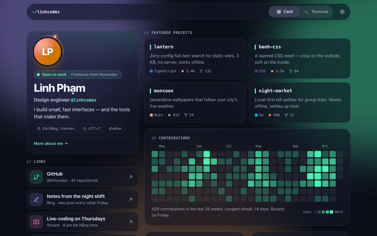
A link-in-bio page for developers, with a card view for everyone and a terminal for the curious
9.000đ
- TemplatePortfolio
Dev Link-in-bio
A link-in-bio page for developers, with a card view for everyone and a terminal for the curious
$4.90